A website for your SaaS product
A SaaS marketing site has seconds to make a stranger understand what your product does and why it's worth a signup. Most bury that behind a feature grid, when the whole game is naming the job it does in the very first line.
What a SaaS product’s website actually needs
Five things, in the order they matter. The first one is most of the job.
Name the job in the first line, not the feature list
A visitor who can't tell what your product does in one sentence leaves before the feature grid finishes loading. Lead with the outcome it delivers in plain language, and let the capabilities earn their place underneath — once someone already wants what you're offering.
Show the product, don't just describe it
Software is bought with the eyes as much as the head. A real screenshot, or a short look at the actual interface, does more to build confidence than three paragraphs of adjectives, because it proves the thing exists and looks like something a person would want to use.
Make signing up the shortest path on the page
Every extra field and every extra click between interest and an account costs you signups you already earned. Put the way in where the eye first lands, ask for the least you need, and let people into the product before you ask them for anything more.
Price it honestly, or say plainly what happens next
The pricing page is often the second thing a serious buyer opens. Hiding it behind 'contact us' reads as expensive and evasive; showing real tiers, or an honest note on how pricing works for now, keeps the people who were ready to pay from leaving to find someone who'll just tell them.
Answer the objection a rival already planted
Anyone comparing tools arrives with a specific worry — migration, lock-in, whether it fits what they already run. Naming that worry and answering it directly, rather than pretending it doesn't exist, is what turns a cautious evaluator into a signup instead of a closed tab.
None of that is a to-do list for you.
Four of your team are working today. Each one owns a stage, and each stage happens for your SaaS product specifically — not for a category you picked off a menu.

Atlas
Asks what your SaaS product actually does — what you specialise in, who calls you, and what you want more of.

Orion
Turns that into a plan you read before anything is built — including which of the five above your page leads with.

Forge
Builds the whole site: the pages, the words, the imagery and the way people get in touch. You can watch or close the tab.

Compass
Puts it live on your own domain, and wires up booking and payments when you’re ready to take money through it.


Echo markets and Ledger counts. Neither has shipped, so neither is on your team yet — we would rather show you the empty chairs.
We haven’t built a SaaS product yet.
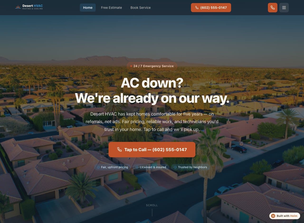
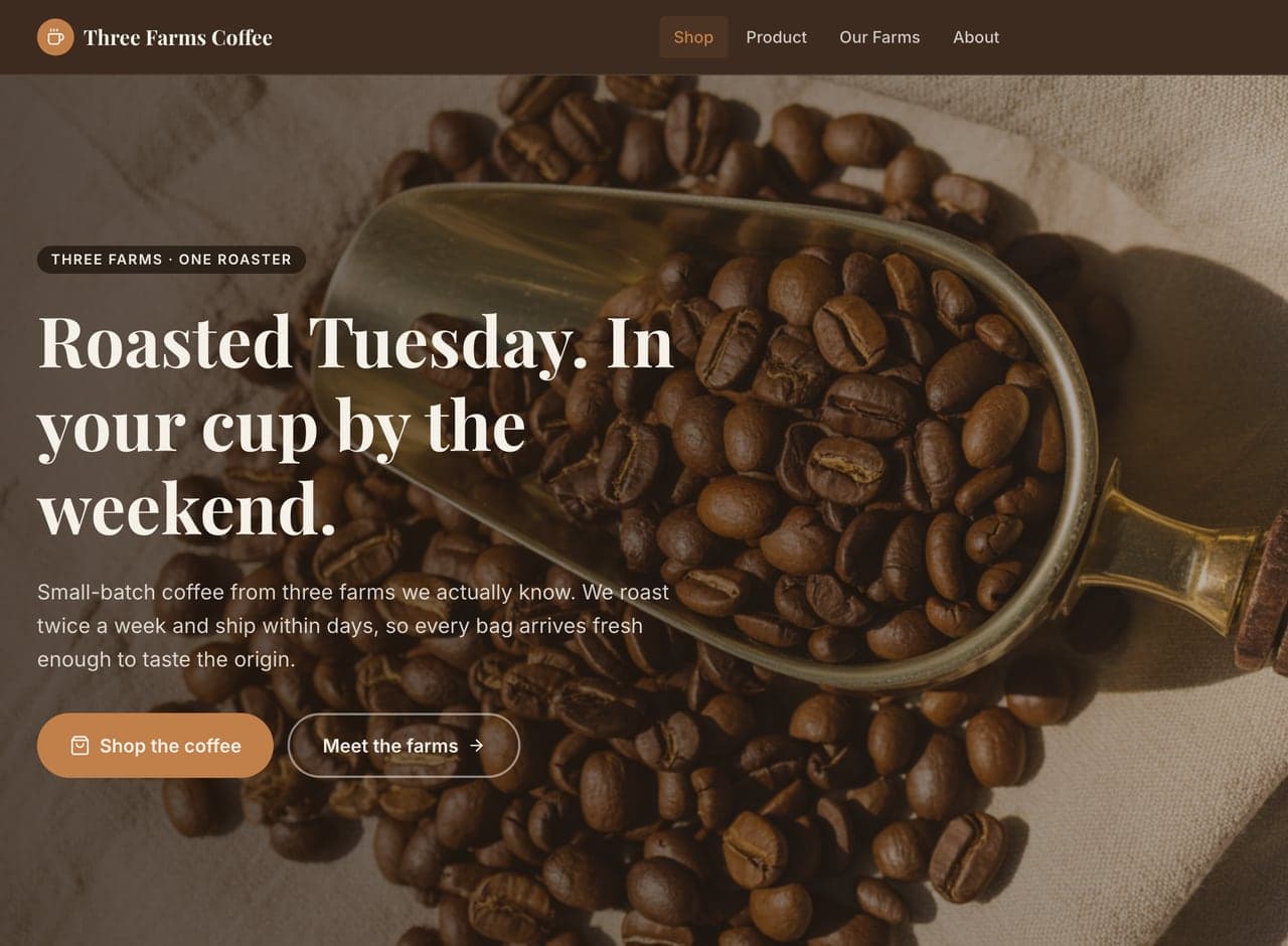
So we’re not going to show you one. These are three real, published Helm builds in other trades — same conversation, same builder. Two of them have a guide of their own if you want to see how the advice changed for a different business.

Common questions
Does Helm build the app itself, or the marketing site?
The marketing site — the public pages that explain your product and turn visitors into signups. Your app is your app; this is the front door that sends the right people into it, with signup and payment flows wired up when you go live.
Can people sign up or subscribe through the site?
Yes. Signup capture and Stripe payments can both be connected when you go live, including recurring subscriptions — so the marketing site can hand a paying customer straight into your product.
Can I update the site every time the product changes?
Yes, and you'll want to. Click into any copy on the page and edit it, or describe the change in plain language and Helm makes it. SaaS positioning moves fast, so this is meant to be something you do yourself in a minute.
Tell Helm about your SaaS product.
A few minutes of conversation, then a plan you read and approve before anything gets built.
Start a planFree to start — you see exactly what Helm produces for your SaaS product before you decide anything.