A website for your mobile app
A mobile app's website exists to do one thing most of the time: get the right person to the download button, on the device they're already holding. Everything else on the page is in service of that single tap, and most app sites forget it.
What a mobile app’s website actually needs
Five things, in the order they matter. The first one is most of the job.
Put the store buttons where a thumb already is
Most people reading an app's website are on a phone, and the moment that matters is the tap through to the store. The download buttons should be visible without scrolling and reachable at the bottom of the screen, not stranded in a header no thumb can comfortably reach.
Show the screens, because that's what they're buying
An app is its interface, and a few honest screenshots of the real thing tell a visitor more than any list of features. Show the app doing the thing it's for, on a phone, so people can picture it in their own hands before they commit to a download.
One benefit, not a tour of every feature
People decide whether to install in seconds, and a wall of features stalls that decision. Lead with the single reason the app earns room on someone's home screen, and leave the full capability list for the store page, where an already-convinced person goes to confirm.
Capture emails while the app is still on the way
If you're pre-launch, the download button has nowhere to go yet — so the page's real job is a waitlist. A simple email capture turns early interest into a list of people to tell the day it ships, instead of visitors you never hear from again.
Handle both phones without making anyone hunt
Your visitors are split across two app stores, and sending someone to the wrong one loses them. Show both routes clearly and let each person take the one that matches the device in their hand, without having to read the fine print to work out which is which.
None of that is a to-do list for you.
Four of your team are working today. Each one owns a stage, and each stage happens for your mobile app specifically — not for a category you picked off a menu.

Atlas
Asks what your mobile app actually does — what you specialise in, who calls you, and what you want more of.

Orion
Turns that into a plan you read before anything is built — including which of the five above your page leads with.

Forge
Builds the whole site: the pages, the words, the imagery and the way people get in touch. You can watch or close the tab.

Compass
Puts it live on your own domain, and wires up booking and payments when you’re ready to take money through it.


Echo markets and Ledger counts. Neither has shipped, so neither is on your team yet — we would rather show you the empty chairs.
We haven’t built a mobile app yet.
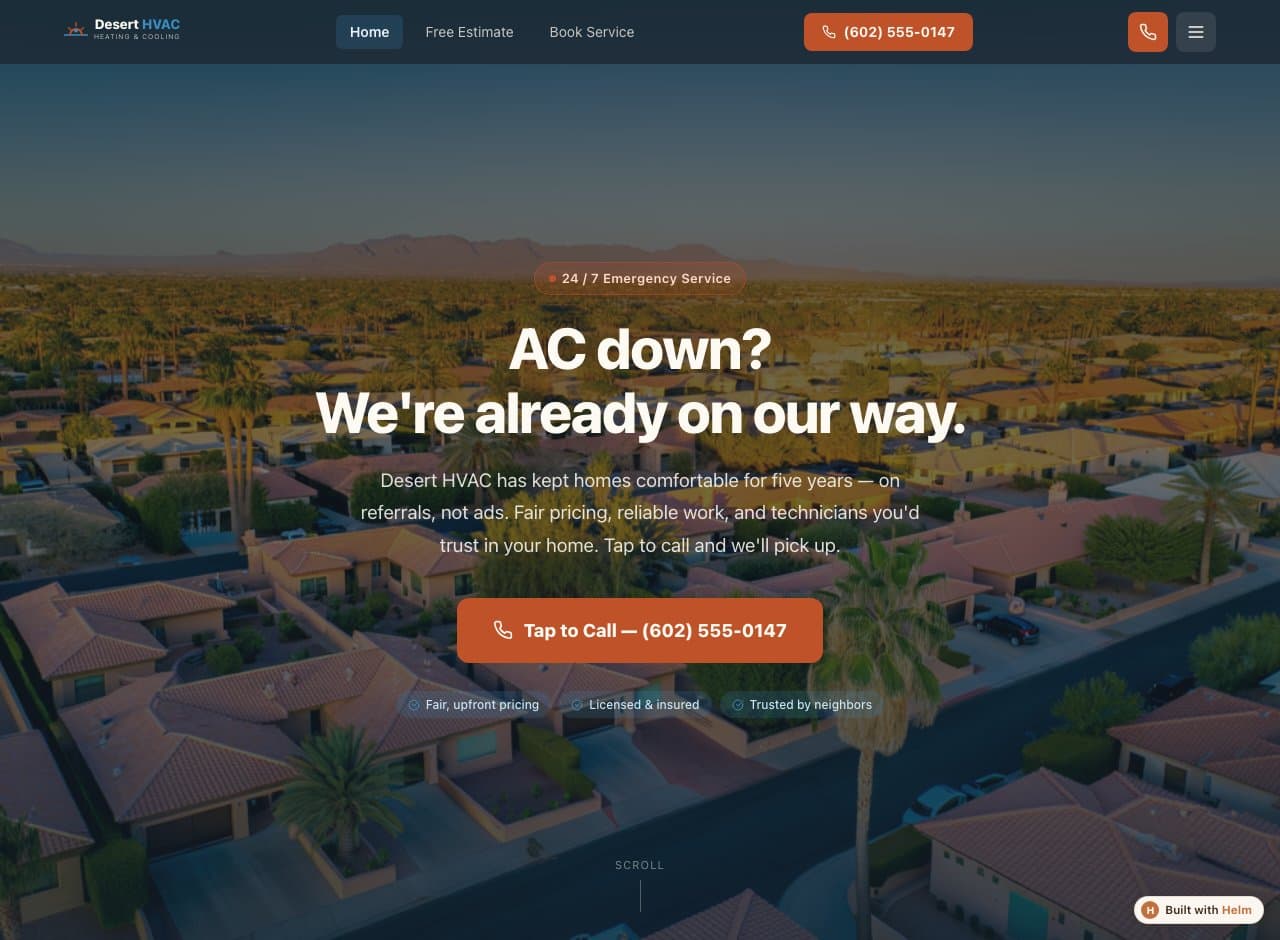
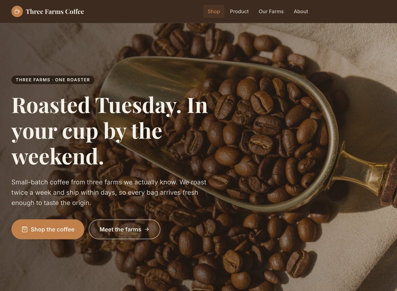
So we’re not going to show you one. These are three real, published Helm builds in other trades — same conversation, same builder. Two of them have a guide of their own if you want to see how the advice changed for a different business.

Common questions
Can the site collect a waitlist before the app launches?
Yes. Email signup capture is part of the build and can be connected when you go live, so a pre-launch page turns curious visitors into a list you can notify the day the app is available.
Can I link straight to the app stores?
Yes — store links are just part of the page, and Helm sets up clear buttons for both platforms so each visitor lands in the right place for their phone.
Do I need my own screenshots?
Helm handles imagery as part of the build, so you're not blocked. That said, real screenshots of your actual app are the most persuasive thing on the page, and you can add them yourself once the site is built.
Tell Helm about your mobile app.
A few minutes of conversation, then a plan you read and approve before anything gets built.
Start a planFree to start — you see exactly what Helm produces for your mobile app before you decide anything.